Saturday, June 30, 2012

Bookstore Flyers


If you self publish, you'll have to pimp your book, and no that doesn't involve popping it into a mini-skirt and dropping it on the corner. That would be easy.

And self-publishing is never easy.

So you've published your book in ebook and print. You've done the holiday free giveaways on Goodreads and Amazon. You've Facebook'd it, gave it a Twitter come out and had every friend with an email post it on their page.

You've even done a few blog interviews and a tour.

But you don't have your book sitting on a physical shelf at a bookstore and you really want that. By the way, that's not a must have for success but if you want it, let me try to help.

First, the chain stores are probably out unless you have a publisher or are already selling really well. Sorry!

But independent and small bookstores are still in the running.

I suggest having all your promo material ready before you call or email these stores. Having a book only won't be enough.

You'll need a:

  1. A website or blog. Even if its a static page, have a page.
  2. Book flyers.
  3. A press kit including bookmarks, postcards, a bio or author promotion sheet & book info including reviews/testimonials.
  4. A poster (optional).
  5. Sample chapter (optional).
  6. Business card.

EXAMPLES of some PROMO MATERIALS I MADE:
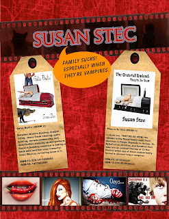
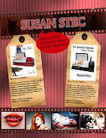
BOOKSTORE FLYER/POSTER


Business Card

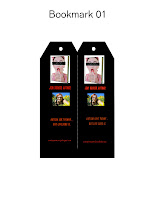
BOOKMARKS


After you put your kit together, drop in these bookstores and the ones that fit your book vibe, see if the owner or manager will talk to you about doing a signing, carrying your book or having a book signing.

You don't want to do the face to face? Try calling or emailing. Smaller bookstores like a professional but personal touch.

Some are going to say flat out no.

No luck locally? Try sending your kits to smaller bookstores within a two or three hour drive of your home town.

But do not send the kit without speaking with someone at the store, have your business card and website ready. If you email them, include a link to your website or flyer (or both). When they say they'll consider it, send them a press kit.

If they say yes, say thank you in writing.

:)

T

Sunday, May 20, 2012

I detest Google Plus

Yes, I know that Blogger is part of Google plus. I use to love my blogger blog, I've had it for years. It's been easy to use and I've enjoyed it.

But I made the horrendous mistake of trying Google Plus. Well, I didn't want to try it but after they killed www.picnik.com, I was strong armed into it. But the Creative Kit was very hard to find, hard to use and the picture quality poor.

Then, it tried to post my pictures to the public. I had my pictures made private but it was keeping my pictures in folders anyway. I didn't want my pictures saved in a third party area in Google Plus. So after I tried the Creative Kit, I deleted those pictures.

And I deleted ONLY those pictures. It was maybe 10 to 15 pictures.

But when I went to my blog, all my pictures for SEVERAL YEARS were gone. No real help is available. I went to the forums, they kept talking about Picassa. I have no idea what that is or where it is. And no, I didn't delete anything from it.

--Yes I did eventually track Picassa down..but I didn't know I even had a folder there. I did not touch said folder.

Somehow blogger, Picassa and Google Plus are all mushed together in some sort of deformed mutant.

All I know is I've lost YEARS of pictures and materials, most of which cannot be recovered. I am so mad I can spit.

And basically the help forum was ...oh well you shouldn't have deleted anything from Picassa...I didn't know my blog was even connected to Picassa...so I didn't touch anything there. And the only pictures I deleted from Google plus were those few recent ones. And somehow that...killed ALL my work for years?

Geez. Great.

Now I find that blogger's dashboard and navigation tools are being changed to make it more like Google Plus. Blah. I'd rather paint my butt pink and date a baboon. Google Plus is just a mess to navigate. Why would I want my blog to work that way? I don't.

Honestly, I detest Google Plus.

If I'm tragically wrong and someone can tell me how to fix the mess that is now my blog, Google Plus and the new interface?

Or if not, does anyone know how I can transfer my blog to somewhere else?

Blood Totems COVER types


Gold eyes, big title, name at bottom, textured.


Saturday, April 21, 2012

How to make a Werewolf...

If you've clicked on this link, I think this means you want to make a werewolf. :) Cool. Now there are more than one type of werewolf.

There are the scary types, the cartoon types and the ones that look more human.


I'm making a human looking one. :) Less muscles, less tail. I want to keep the humanity of it since my werewolf is for a shapeshifter novel, not a werewolf horror film. First find a man (or a woman). Wouldn't you know...my mother was right. I need to find a man.


HERE IS MY MAN. Why did I choose him?

Well he had black and white background, it's easier to not have to worry about the background. I can easily find a wolf's head on a black background. This way when you blend, you won't need to worry about the trees, grass or buildings. Don't worry, you can always add those in later. Then I need a wolf's head.


I don't recommend you try to make a full body werewolf he first time. The face/neck will do nicely for practice. I chose this wolf because it has a good black background. It'll blend with my man background easily. Can you just layer one over the other? Sure but it'll look like crap. It's easier to use the cloning tool in www.ipiccy.com to create a more designed werewolf. Instead, go to fotoflexer.com. Load the man picture. Then click LAYERS then click ADD IMAGES. Load the wolf.

Resize the wolf to be slightly smaller than the man's head. You'll not want to make the eyes to be too far apart and if you make the wolf head too large. The eyes won't line up if you do. Then tilt the heads into the same direction of the photos. Save the two pictures side by side.

 Go to www.ipiccy.com.


 Yeah life was easier before Picnik was taken away from the company who shall not be named. But BLAH on them.

Upload the double photo of man/wolf.

Scroll down to the clone tool. It's on the table on the left.

Click the green circle on what you want to copy. Put the white circle on where you want it to be copied to. I really suggest you make the clone tool small. You want to do this in small pieces.

Second type, don't be afraid of the FADE functionality to adjust the hair opaqueness. Start on the chest. Best to start on the easiest places. Paint in the chest hair on the man from the ruff hair on the wolf. You can layer the hair to make it thicker. You can Fade to make the human skin show more. When you get it right on the neck/chest. Save. You will do the face in tiny pieces.

Next use the far outer hair on the sides of the wolf to layer hair on the cheeks of the man. Use the fade to get the layer between man and wolf. When you get it right then SAVE. Now for the hard parts. Starting at mid-nose on the man and between the eyes on the wolf. Paint the beautiful forehead coloring on the man's forehead and between the eyes.

Save.

Then line up the ears where you want them, clone them in. Blend the blackground using the CLONE tool. Save. Then the worst part...the nose.

Sigh.

Take the black nose and line it over the end of the man's nose, use the fade to find the right level of darkness. Expect to do it several times to get it the way you want it. That's why you do it last. You'll know when it' looks right.

Save.

Then go to Effects (looks like a magical star wand). Use bloom to soften the picture and vibrancy to make it brighter. set it to where you like it. SAVE again.

And now you have a werewolf.

 Okay, it's not perfect. But it is clearly a werewolf man and will work for a book trailer. Work for you? .


Wednesday, March 21, 2012

Giveaway Covers again

It's that time of the year again...giveaway covers.

These were all created for specific projects but were rejected for some reason or another.

The rules work the same as always.

Must be used within in six months.
Must contact me if you are using the cover so I can list it as inactive.
I'll add your title/author name only--No giant edits.

Tirz


Wednesday, February 15, 2012

What A Cover Tells You...


One of the biggest mistakes a self-published author can make in designing their own book cover is trying to tell the entire story in the book cover. The writer wants to take something that took them over 80,000 words and condense it into one image.

It's almost impossible and it usually doesn't work anyway.

First, you want a cover that let's the eye focus. A cluttered cover usually makes your cover confuse the reader's eye. One doesn't know what to look at which means most readers will just move on.

Second, the cover should entice but still leave a surprise for the plot to reveal.

Third, the cover should fit your genre and mood. No one buys a romance cover expecting to get a book on a car maintenance. Make it match.

Fourth...don't forget to put your title/author name on. Yeah, I know this one doesn't have that. Font matters and should fit the look as well. I'm still working on this one.

So look at the lovely cover above (and yes it's a work in progress), what can you tell me about the book from just the cover?

Some questions to consider:

Who is the main character?

What genre is this novel? Fantasy, Sci-Fi, Romance, Action-Adventure, Humor
How can you tell?

What is the mood of the book?

What is the setting?

What is your best guess on the plot?

And just think, all that information from from a picture that is very simple.

Does that help you plan your cover?

Monday, January 16, 2012

The Creative Brain (Digital Art)


I love the digital painter, as you know.

This one is called 'The Creative Brain'.

Tirz

Monday, January 9, 2012

Awakening--Adding Wolves to a Picture


Small changes can change the mood of a book cover. The original cover is above. The author wants to add a wolf or wolf eyes to the picture to give more of a hint at the book's plot. But how I add that wolf or wolf eyes without changing the reader's perception of the book?

You can't.


PICTURE DISCUSSIONS:


In Version 2, I overlaid the full wolf head over picture. This implies the wolf influences the girl and the whole story. The wolf and the girl vie for the main character position.

VERSION 2


However if I change the wolf to just the eyes in the background, it changes the mood and meaning.

In the cover below, there are just wolf eyes. To me these eyes seem rather malevolent but that's my impression. It definitely implies supernatural and the wolf influence in the book could be seen as negative or a guardian. The wolf eyes look over on the girl and story. So the wolf sees all but is it looking out for the girl's best interest or looking out to keep the girl from hurting someone else's best interest? VERSION 3.

VERSION 3


In the version below (Version 4), the whole wolf head has been integrated. As stated above, the girl and wolf are both trying to be the main character. But is that what the author wants? The wolf is neither negative nor positive in this version. But the wolf overshadows the story in this version. The head is bigger than the girl and facing the reader.

The wolf in this story is probably positive or neutral BUT the wolf effects everything. The wolf is the main part of the story.

In Version 4, Large Wolf Head,


In Version 5, the wolf head is small and located over the girl's head. The wolf is smaller than the girl. In this version, the wolf is more a totem or symbolic in the story. It implies, the idea of wolves is center to the story but the girl is the focus. With it being over her head, it implies it is hanging over her head.

VERSION 5--Small Wolf Head


Ah the white wolf (VERSION 6), angelic, sweet--definitely positive. The wolf is nearly see through so it implies fantasy or supernatural elements. The color implies goodness or angelic. The wolf is looking at the reader but remains close the girl like a guardian.

VERSION 6 White Wolf


In Version 7, the wolf is dark in color, the eyes are a demonic yellow and the wolf is moving toward the girl and reader. The wolf is aggressive and negative. The wolf is surrounding the girl but it's not good for her. The light ghosty feel to the wolf implies supernatural again...as does the yellow eyes that glow.

VERSION 7 Black Wolf


So small changes such as size, opaqueness and coloring of an image can change the impression of the story. The main image of the story doesn't change, the girl in a red dress at a garden gate looking out at a misty view under the moon.

The type of wolves and where they are located gives the reader different clues. So when you create your covers,think about what your images IMPLY to the reader. In this story, I have to ask the author, how does she want the wolves to be perceived in the story? That will tell me what is the right wolf.

Monday, January 2, 2012

Digital Painting---Green in Evening


I've been playing with the digital painter again.

I love that thing.

:)

This one is the green of leaves in late evening with fireflies mixed in...or perhaps fairy lights? :) So it's not Picasso..I like it anyway.


T